In the previous blog post, we created a basic custom dialog using R code in SPSS Statistics that allowed us to generate a visual representation of a correlation matrix i.e., a correlogram. In this final posting, we will see how to add a number of additional elements that control the styling and appearance of the procedure’s output. To edit the currently installed custom dialog, from the main menu, click:
Extensions > Custom Dialog Builder for Extensions > Continue
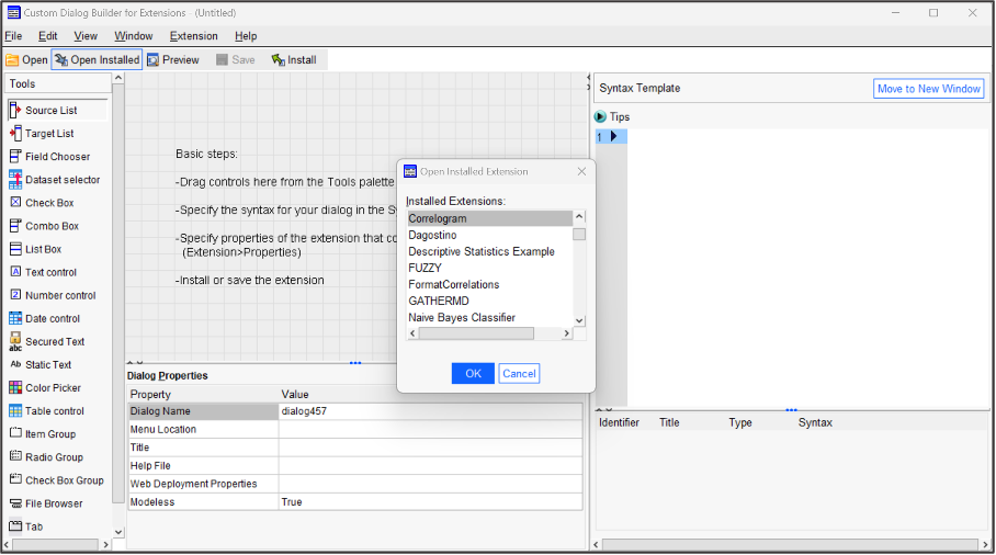
Having launched the builder, we can open our previously installed correlogram dialog. From the toolbar on the Custom Dialog Builder click:
Open Installed
From the Installed Extensions list choose:
Correlogram > OK
This is illustrated in the following image.
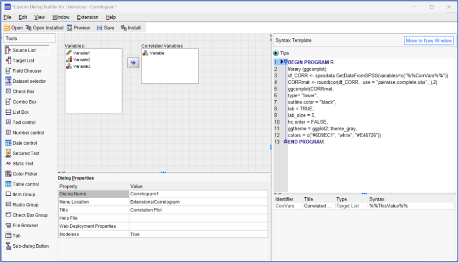
The Correlogram dialog in now shown in the builder interface.
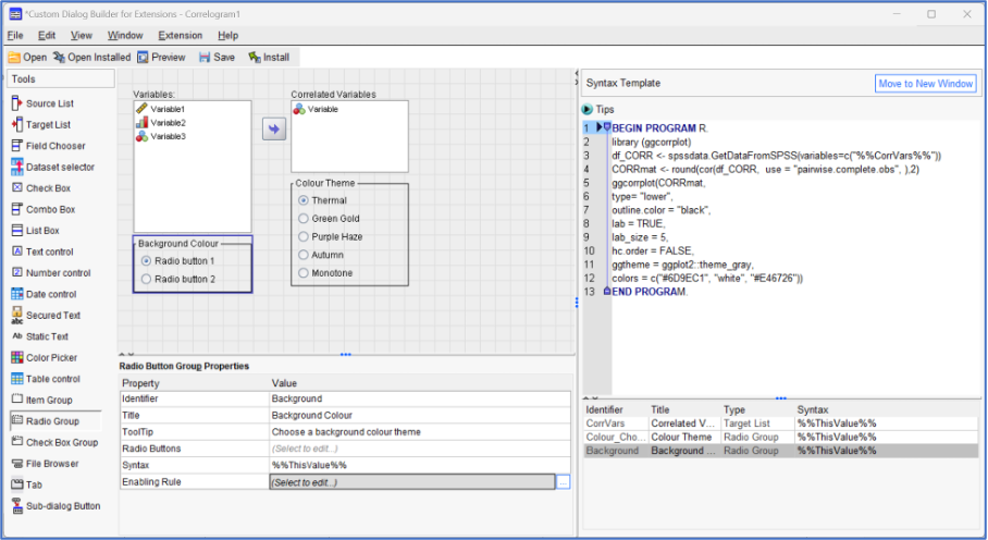
The first thing we’re going to do is add an option to allow a user to choose from a number of predefined colour schemes. Each colour scheme will be selected in the custom dialog by clicking a radio button. To create this option, from the Tools menu on the left-hand side, click and drag the following object type:
Radio Group
It makes sense to place this object under the Target Variable List box. Having added the Radio Group object, we also need to edit the properties of the object itself. Firstly, and most importantly, we should change the name of the identifier to something a little more descriptive. Select the Radio Group object and within the Properties section, in the cell next to Identifier, change whatever the current value is to:
Colour_Chooser
Now change the title property to:
Colour Theme
You may also wish to provide some ToolTip text such as:
Choose a colour theme for the correlogram
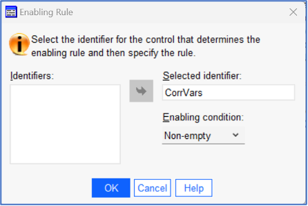
Finally, you can edit the Enabling Rule property, by clicking the ellipsis in its adjacent cell. An enabling rule means that the user won’t be able to click an option unless some other identifier is utilised. In this example, it means that the colour theme radio buttons will remain greyed-out unless variables are sent to the target list area. Within the Enabling Rule, sub-dialog, choose the identifier:
CorrVars
Send the identifier to the Selected identifier box and make sure the enabling condition is set to:
Non-empty
This is shown in the next image.
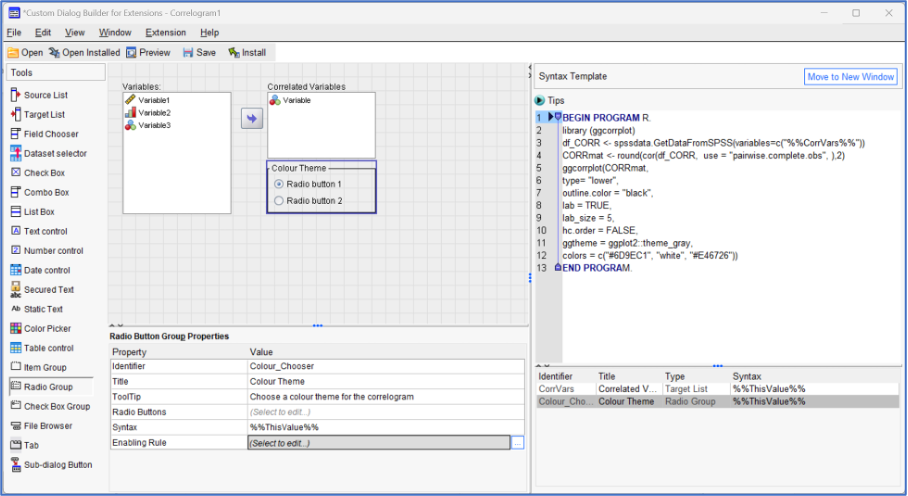
The custom dialog at this stage, is shown in the next image.
Having added a radio group and edited some of its properties, we now need to edit the radio buttons themselves so that each one triggers the dialog to generate a correlogram with a different colour scheme. To do so, in the Properties section of the selected object, click the ellipsis button corresponding to:
Radio Buttons
This will generate a sub-dialog like that shown in the next image.
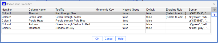
Don’t worry if in your own instance the identifier values are labelled differently. Also, feel free to use different colour schemes and labels when creating your own custom dialog. In this example, we will edit the properties of the dialog according to the values in the following table (leaving any other properties untouched).
| Identifier | Column Name | ToolTip | Syntax |
| Colour1 | Thermal | Red through Blue | c(“#8196c7”, “white”, “#d45d5d”)) |
| Colour2 | Green Gold | Green through Yellow | c(“yellow”, “white”, “#5fe051”)) |
| Colour3 | Purple Haze | Purple through Pale Blue | c(“#27d6d9”, “white”, “#d451e0”)) |
| Colour4 | Autumn | Green through Yellow to Red | c(“green”, “yellow”, “red”)) |
| Colour5 | Monotone | Shades of Grey | c(“dark gray”, “white”, “dark gray”)) |
Obviously, a key aspect of this properties dialog is the code that chooses the actual column options themselves in the final Syntax column. The completed dialog is shown in the next image.
To complete the process, and return to the main dialog builder click:
OK
Now we can add a second, smaller radio group that chooses a background colour for the correlogram. Again, from the left-hand side of the builder, click and drag the another:
Radio Group
In this case, place this object under the source variable list (you can always move these objects around later). Again, within the Properties section, in the cell next to the Identifier label, change the value to:
Background
Now change the title property to:
Background Colour
Feel free to provide some ToolTip text such as:
Choose a background colour theme
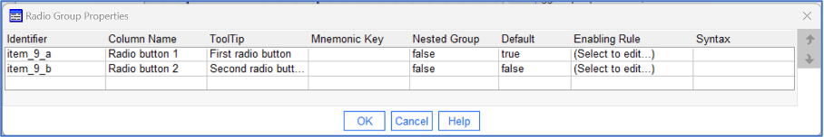
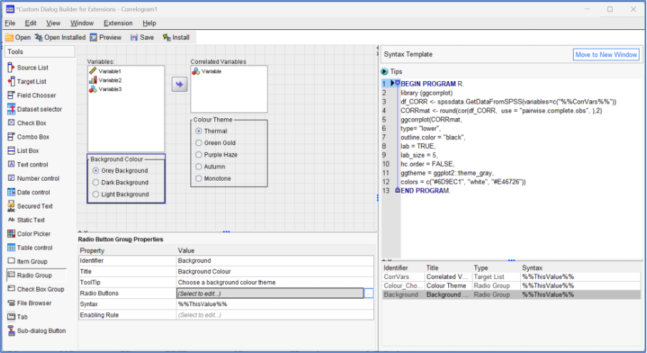
Finally, you can edit the Enabling Rule property, again using the same settings as before, choosing the CorrVars identifier and setting the enabling condition to Non-empty. The following image shows the partially completed dialog at this stage.
Once more, we need to edit the properties of the radio buttons themselves. In the Properties section of the selected object, click the ellipsis button corresponding to:
Radio Buttons
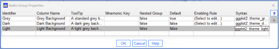
Edit the sub-dialog according to the properties of the following table.
| Identifier | Column Name | ToolTip | Syntax |
| Grey | Grey Background | A standard grey background | ggplot2::theme_gray |
| Dark | Dark Background | A dark grey background | ggplot2::theme_dark |
| Light | Light Background | A light grey background | ggplot2::theme_light |
The completed dialog is shown in the next image.
To complete the process, and return to the main dialog builder click:
OK
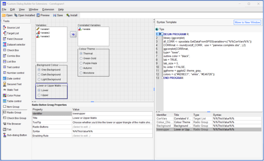
We need to add one more radio group to control whether the lower triangle of the matrix is displayed or the upper one. Again, from the left-hand side of the builder, click and drag another:
Radio Group
In this case, place the object under the previous background colour radio group. Once more, within the Properties section, in the cell next to Identifier change the value to:
lowerupper
Now change the title property to:
Lower or Upper Matrix
Provide some ToolTip text such as:
Choose whether you’d like the lower or upper triangle of the matrix shown
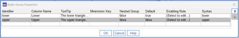
As before, edit the Enabling Rule property, choosing the CorrVars identifier and setting the enabling condition to Non-empty. Now click the ellipsis button next to the Radio Buttons property and edit the sub-dialog using the values in the following table.
| Identifier | Column Name | ToolTip | Syntax |
| Lower | Lower Matrix | The lower triangle of the matrix is shown | lower |
| Upper | Upper Matrix | The upper triangle of the matrix is shown | upper |
To complete the process, and return to the main dialog builder click:
OK
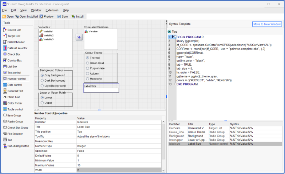
We still have two more optional controls that we can add. This time however, we will add a Number control object to allow users to change the size of the coefficient labels. To do so, from the palette on the left-hand side, click and drag the object labelled:
Number control
Place the object under our first radio group labelled Colour Theme. Clicking on the object, edit the main properties in the following manner leaving all the other values as they are:
Identifier: labelsize
Title: Label Size
ToolTip: Adjust the size of the labels
Numeric Type: Integer
Default Value: 5
Minimum Value: 1
Maximum Value: 10
Width: 2
The completed Number control object is shown in the following image.
Finally, we will add one last optional control allowing users to request that the correlation matrix is clustered hierarchically according to the correlation values. This time, we will offer the option as a simple checkbox. From the object palette on the left side of the builder dialog, click and drag the object labelled:
Check box
Place the object under the previously created Label Size control. Having, done so, select the object and edit the main properties in the following manner leaving all other values as they are:
Identifier: hiclus
Title: Hierarchical Clustering
ToolTip: Check this option to enable hierarchical clustering
Default value: Unchecked
Checked syntax: TRUE
Unchecked syntax: FALSE
The completed Check box control object is shown in the following image.
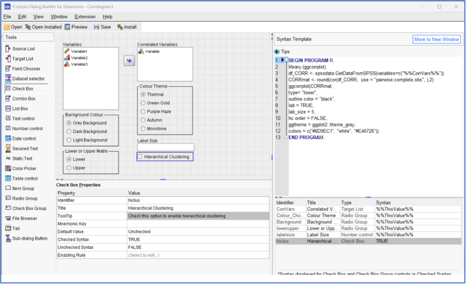
Having added all of our additional controls to the dialog builder, the last critical step in the process is to map each control’s identifier to the R code displayed in the adjacent Syntax Template. In order for the dialog to treat the control identifiers, as parameters we need only ensure that they are encapsulated double % signs. For example, the syntax code:
ggtheme = ggplot2::theme_grayNow becomes:
ggtheme =%%Background%%,One small addition we might want to make to the existing code, is to add commands to remove the two data objects (df_CORR and CORRmat) we created earlier in the syntax. This is not an actual requirement to make the code run, but it is regarded as ‘neater’ to remove from memory space any superfluous objects that the procedure no longer needs. The is done using the rm() function. To remove these two objects, we simply add the following lines of code before final END PROGRAM statement.
rm(df_CORR)
rm (CORRmat)
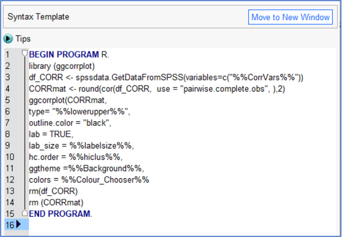
By adding these lines and replacing each option choice in the R code with our identifier parameters, our syntax template now consists of the following text:
BEGIN PROGRAM R.
library (ggcorrplot)
df_CORR <- spssdata.GetDataFromSPSS(variables=c("%%CorrVars%%"))
CORRmat <- round(cor(df_CORR,  use = "pairwise.complete.obs", ),2)
ggcorrplot(CORRmat,
type= "%%lowerupper%%",
outline.color = "black",
lab = TRUE,
lab_size = %%labelsize%%,
hc.order = %%hiclus%%,
ggtheme =%%Background%%,
colors = %%Colour_Chooser%%
rm(df_CORR)
rm (CORRmat)
END PROGRAM.
The following image shows the completed syntax template.
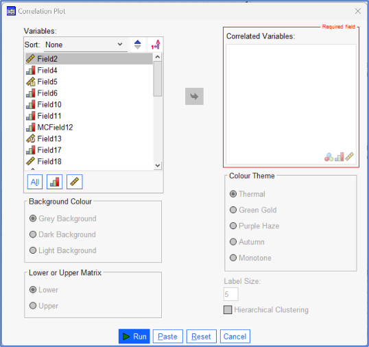
Clicking the Preview button will allow us one final check to see if new dialog looks ok.
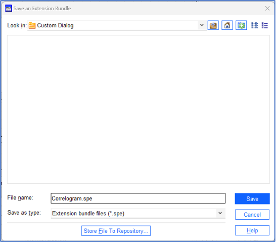
It’s also advisable that we save the dialog to take account of changes we’ve made to the dialog extension file (.spe). Click:
File > Save
Feel free to choose a new name and location or overwrite the previous file.
Finally, we need to install the custom dialog, in this case, overwriting the previous version. Within the builder dialog, click:
File > Install
You will see the following message:
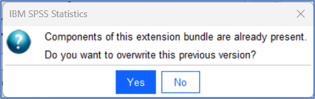
To proceed, click:
Yes
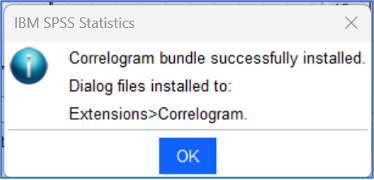
The following message should appear.
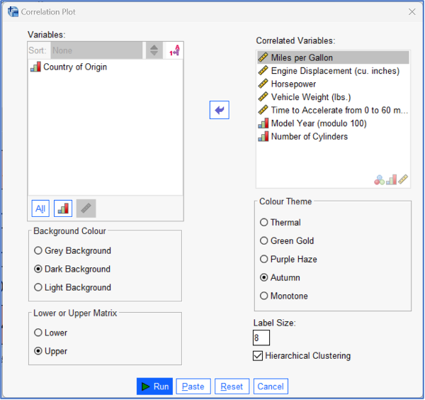
Finally, we can test the new custom dialog. Close the Custom Dialog Builder and from the main menu in the Data Editor window, click:
Extensions > Correlogram
To test out the procedure, make a few selections to these newly added optional elements, such as those shown in the following image.
The output resulting from this procedure is shown next.
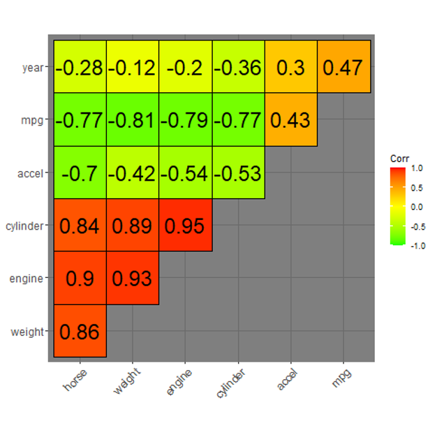
We can also see the syntax that generated this output.
BEGIN PROGRAM R.
library (ggcorrplot)
df_CORR <- spssdata.GetDataFromSPSS(variables=c("mpg engine horse weight accel year cylinder"))
CORRmat <- round(cor(df_CORR,  use = "pairwise.complete.obs", ),2)
ggcorrplot(CORRmat,
type= "upper",
outline.color = "black",
lab = TRUE,
lab_size = 8,
hc.order = TRUE,
ggtheme =ggplot2::theme_dark,
colors = c("green", "yellow", "red"))
rm(df_CORR)
rm (CORRmat)
END PROGRAM.
Having created our own custom dialog based on R code and executed it successfully within SPSS Statistics, we could now share the dialog’s .spe file with other users so that they too could install and work with the procedure as well. To do so, they need only click:
Extensions > Install Local Extension Bundle