Correlation is a term that we employ in everyday speech to denote things that appear to have a mutual relationship. In the world of analytics correlations are specific values that are calculated in order quantify the relationships between variables. This kind of analysis is powerful because it allows us measure the association between factors such as advertising spend and website hits, product sales and competitor pricing, Net Promoter Score and customer discount, ambient temperature and component part failure.
Not only can we measure this relationship but we can also use one variable to predict the other. For example, if we know how much we’re planning to increase our spend on advertising then we can use correlation to accurately predict what the increase in visitors to the website is likely to be. This is because, within certain limits, we can measure the correlation using a specific number.
Visualising correlation using scatterplots
The relationship between two variables can be visualised using scatterplots, as in the examples below.
- Scatterplot A shows the relationship between vehicle weight and horsepower
- Scatterplot B shows the relationship between vehicle miles per gallon and the time it takes to accelerate from 0-60mph
- Scatterplot C shows the relationship between vehicle horsepower and time taken to accelerate from 0-60mph
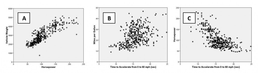
Graph A shows a strong positive relationship between the horsepower of various cars and the respective weight of the vehicles. Graph B also shows a positive relationship (although not as strong as graph A) between the time taken to accelerate to 60mph and the car’s fuel consumption in miles per gallon. Finally graph C shows a strong negative relationship between horsepower and time taken to accelerate to 60mph (in other words less powerful cars accelerate more slowly).
Quantifying a relationship using the correlation coefficient
Although scatterplots help us to visualize relationships like this, they don’t allow us to quantify the pattern. This is where a correlation coefficient comes in handy. Using a Pearson’s correlation coefficient (sometimes denoted as Pearson’s r) we can measure the strength of the linear (i.e. straight line) relationship within each graph. Pearson’s correlation coefficient is a number that runs from -1 to +1 (for a more technical explanation click here).
Values approaching either of these two numerical limits indicate stronger linear relationships, whereas values closer to 0 indicate weaker relationships (or no relationship at all). A positive correlation value means that the variables concerned increase or decrease in parallel – as one increases or decreases so does the other – whereas a negative correlation value indicates that as one variable increases the other decreases, or vice versa. Let’s look at the graphs again but this time we will reveal their correlation values.
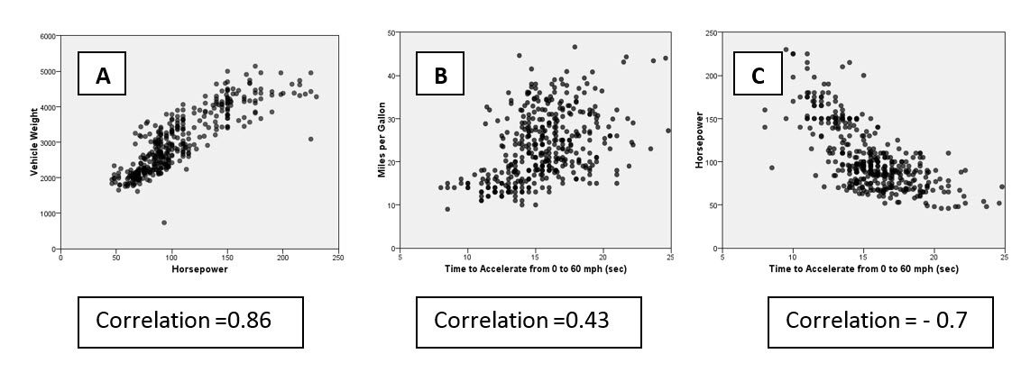
We can see that graph A with a correlation of 0.86 indicates a much stronger relationship between horsepower and weight than Graph B’s correlation of 0.43 measuring the relationship between acceleration and mpg. Whereas graph C also indicates a strong linear relationship, here it generates a negative value of -0.7, meaning that as horsepower increases so acceleration time decreases. If the relationships between these factors were much weaker, then we would expect to see correlations with much smaller magnitudes such as 0.2 or 0.1.
Using exactly the same approach we can measure and compare the relationship between initial spend and tenure, or between advertising and new registrations, or repeat visits and waiting times. We’ve all heard the adage that “correlation does not imply causation”. That makes sense because there is almost certainly a correlation between ice cream sales and incidents of drowning but it’s most likely due to coincidence i.e. the fact that ice cream sales are higher in summer when a lot more people go swimming. However, even though correlation doesn’t imply causation, very often the fact that we measure the strength of a relationship and prove its existence in the first place can greatly enhance our decision making.