This is the latest in our ‘eat your greens’ series – a back to basics look at core statistical concepts that are often misunderstood or misapplied.
In everyday speech the term ‘correlation’ refers to a mutual connection or relationship between two things. In statistics correlations are specific measures or values that attempt to quantify the strength of linear relationships between pairs of variables. By linear, we simply mean that the relationships (more or less) follow the path of a straight line. An example of a pure linear relationship would be one where every time a particular material doubled in size, its weight also doubled.
In statistical analysis, by far the most well-known correlation measure is Pearson’s Product-Moment Correlation (more often referred to as Pearson’s r). The Pearson’s r coefficient is a measure of covariance, which means that it estimates the amount of shared variability between two variables. Moreover, it is a standardised measure of covariance, in that no matter what units the variables themselves are recorded in, their covariance as measured by the r value, is shown on a standard scale running from -1 to 1.
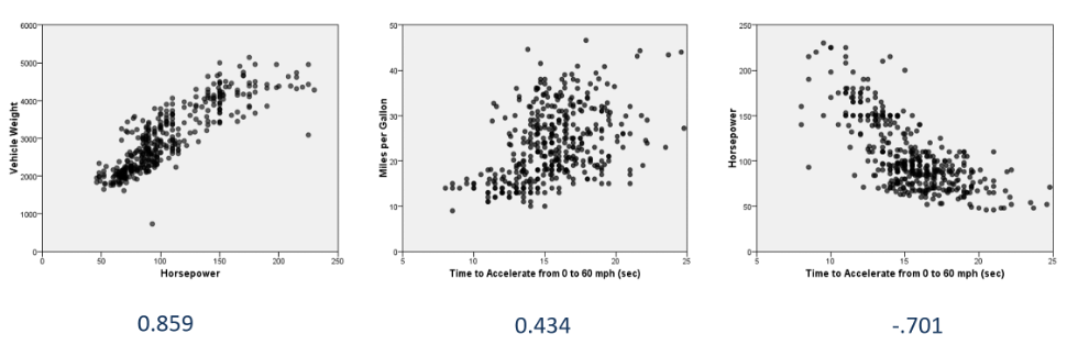
Correlation coefficients can therefore be used to quantify the strength of linear relationships between pairs of variables in the same way as scatter plots can be used to illustrate them. The image below shows three scatterplots where each point represents a different car. The axes of the charts show various measures related to vehicle performance such as horsepower, acceleration and fuel efficiency.
From left to right, we can see that the first scatter plot displays a relatively strong positive relationship between horsepower and vehicle weight. As the values in one axis increase, the values in the corresponding axis also show a proportionate increase. The strength of this relationship is reflected in its high correlation value of 0.859. The second scatter plot illustrates how the time taken to get to 60 mph is correlated with miles per gallon of fuel consumption. This relationship is less well defined and so shows a somewhat weaker correlation coefficient of 0.434. The third plot shows a strong negative relationship indicating that cars with less horsepower take longer to accelerate. As such the r value here is -.701.
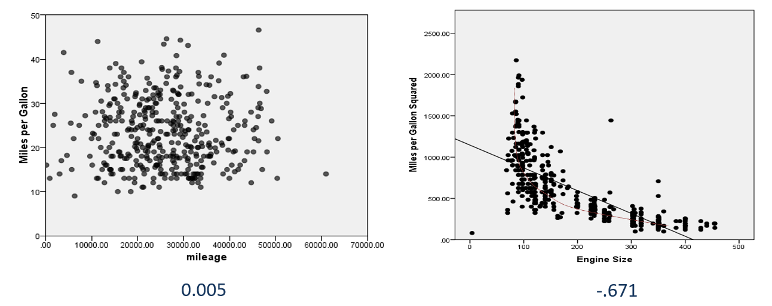
We can further explore how correlations are reflected in scatter plots by examining two more charts. The next scatter plot shows the relationship between mileage and miles per gallon. Of course, there’s reason to expect that either of these factors should be related to one another and so the chart seems to show a random ‘cloud’ of data points. Here the correlation is perilously close to zero (0.005) indicating that there is no linear relationship between the variables. Lastly, we see a chart illustrating a distinctly non-linear relationship between miles per gallon squared and engine size. Although the correlation is a relatively strong negative value of -0.671, we can also see that the pattern of points does not follow a straight line. This simply serves to illustrate that Pearson’s r correlations cannot detect non-linear relationships even if the coefficient values are notable.
This leads to us to two important points. Firstly, even if the r value is weak or close to zero, it doesn’t mean that no relationship exists between the variables. Charts that exhibit ‘U’ or ‘J’ shaped plots may still indicate a relationship, just not a linear one. Secondly, it’s something of cliché these days to point out that ‘correlation does not imply causation’. Conversely though, lack of causation does not imply lack of relationship. Two things can still be related even if one does not cause the other – and that might be interesting.
Lastly, let’s briefly look at the issue of ‘significance’ testing and correlations. In most statistical packages when correlations are presented, they also include the number of cases used to calculate the coefficient as well as a probability (or ‘P’ value). But it’s important to note that the null hypothesis associated with these coefficients is that correlation is zero in the population. This means that even small correlation coefficients can yield ‘significant’ results. As an example, the table below shows the correlation between mileage and average vehicle emissions.
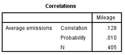
Although the probability is ‘significant’ at 0.01 the correlation itself is very weak at a mere 0.128 (not far above zero). Clearly the significance test is not an indication of a strong relationship. Rather it is showing that with 405 cases, the probability of getting a result as ‘extreme’ as 0.128 is still only around 1% if we assume that in the population the actual correlation value is zero. For this reason, analysts tend to interpret correlation values as indicators of ‘effect size’ rather than purely as tests of statistical significance.