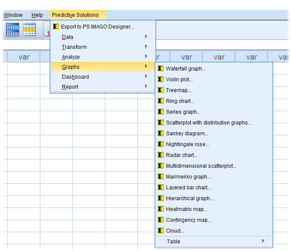
PS Imago Pro is a statistical analysis and reporting solution based on IBM SPSS Statistics. Indeed, apart from the inclusion of an additional menu, users of SPSS Statistics may find that the data analysis module of PS Imago Pro looks almost identical to its SPSS counterpart. However, as Figure 1 shows, this additional menu contains an extensive array of charting capabilities that are not available in SPSS Statistics. In this we can explore examples of these graphing enhancements that aren’t available through the standard SPSS Statistics offering.
Combining Tabulation and Charting
Each of the charts within PS Imago Pro can be created using a set of pre-built template themes (e.g. ‘Winter’, ‘Spring’, ‘Summer’ or ‘Fall’). Furthermore, as figure 2 shows, one of the most innovative ways that PS Imago Pro can display analysis results is by combining standard tabulation with its graphing abilities.
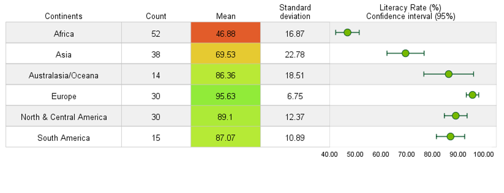
Figure 2 shows average continental literacy rate (based on data from the early 1990’s) sorted in ascending order with a gradient colour scheme applied. Note that the chart also includes error bars showing the 95% confidence intervals for the means of each of the groups.
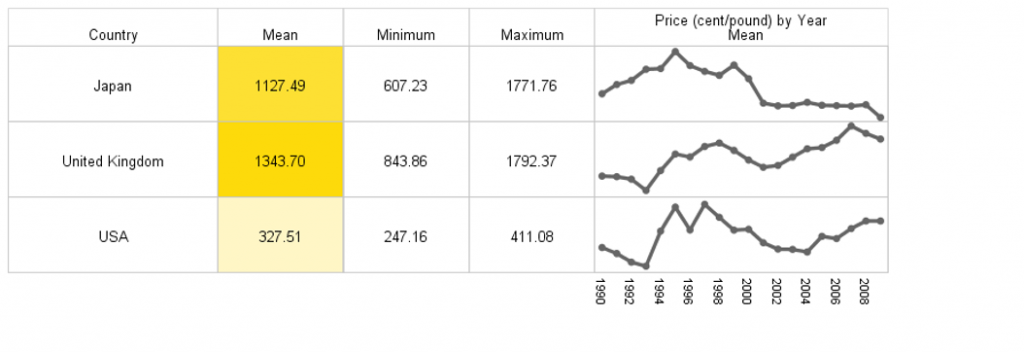
In a similar way figure 3 shows, the mean price per pound of coffee broken down by three countries. Note that the table also includes a small time series chart for each group showing how the price has varied over the course of two decades.
Creating ‘Dashboard’ charts
Figure 4 shows an example of the kind of dashboard performance charts that PS Imago can create. This ‘Thermometer’ chart shows the sales performance of six different cities using the ‘Spring’ template theme. The chart is easy to create as the performance percentage is automatically calculated by comparing the actual performance (in this case revenue values) as measured in one column against a target value measured in a separate column. Figure 5 shows the same relationships, but this time represented more succinctly using a ‘gauge’ chart.
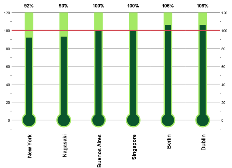
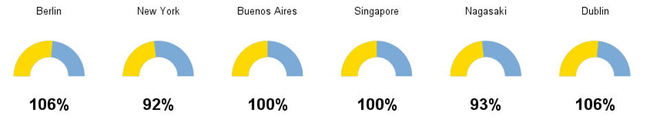
Figure 6 shows an example of a Radar chart. These charts are useful for comparing different rating profiles. In this case the chart shows how three confectionery products have been evaluated in terms of four sensory dimensions: ‘Salty’, ‘Sweet’, ‘Crunchy’ and ‘Smooth’. The points on each dimension represent the average evaluation score for that sensory dimension.
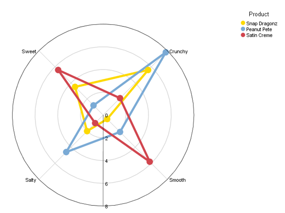
Figure 7 shows a dartboard chart. The chart shows how guests rated the importance of different aspects of hotel accommodation. Factors which are closer to the centre of the concentric circles indicate that they are rated higher than those in the outer circles. In this example ‘Price’, with a score of 21.8, has the highest rating closely followed by ‘Customer Service’ with a score of 20.5. Note that both the size of the circles representing the ‘darts’ and the colour scheme play a role in indicating each factor’s importance. Higher ratings are associated with larger circles closer to the green zone and lower scores are associated with smaller circles nearer the red zone.
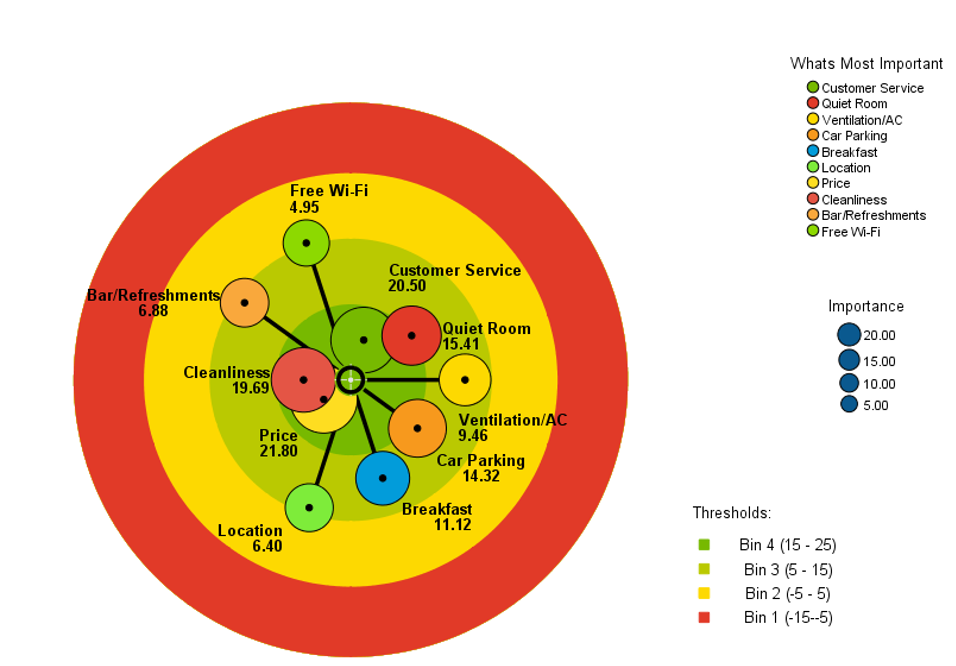
Figure 8 shows a Sankey diagram. These charts are useful for representing flows or processes either over time or from one location to another. Although PS Imago Pro allows the user to create Sankey charts showing the flow across multiple points, in this example there are only two variables representing departure airport and destination airport. The data here are fictional but serve to show how Sankey charts are an efficient method to represent relationships comprised of multiple permutations between two categorical variables. In this case the flows in the chart have been coloured by the arrival airport. In other words, it shows where the flights arriving at the airports on the right-hand side of the chart originated from.
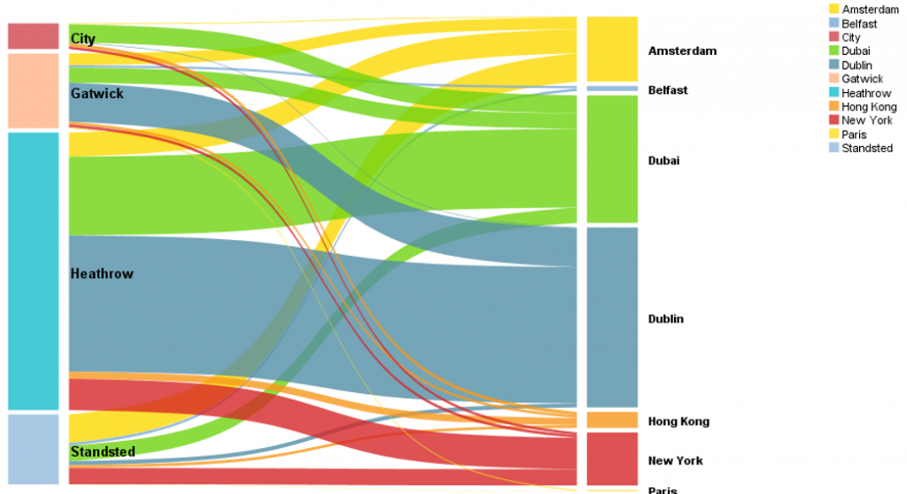
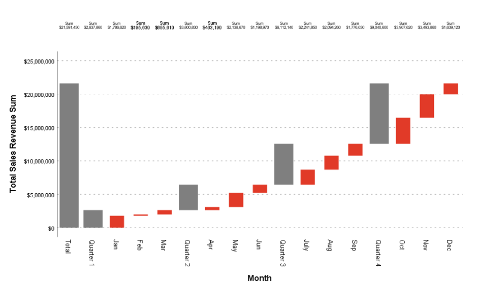
Figure 9 shows a waterfall chart. These types of graph are commonly used to illustrate the contribution of individual elements an overall result. In this case, the chart simply shows which months and quarters contribute to total annual revenue. The same chart could be used to show how specific tasks contribute to total elapsed time in a given process or how expenditure is broken down in the delivery of a product or service.
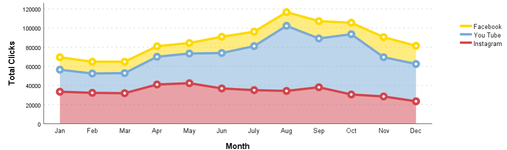
Finally, figure 10 shows a series chart. Here the graph simply illustrates the contribution of different online marketing channels (Instagram, You Tube and Facebook) to total clicks in response to an offer over a 12-month period. This is an attractive alternative to the area charts that are available via the Chart Builder facility in SPSS Statistics.
PS Imago Pro not only provides a portfolio of graphing enhancements, but also a number of time-saving data manipulation and transformation procedures and even a dedicated report designer platform for easy deployment of results to stakeholders and colleagues. For more information click here.