Smart Vision Europe recently announced an exciting new partnership with DataRobot, a rapidly rising player in the data science market with ambitions to be the de-facto leader of cloud-based AI for all.
Over the past few months, I’ve been playing around with the platform, and I must say I am thoroughly impressed with what I have discovered. One reason is simply that, for so many AI tech companies, the absolute holy grail of cloud analytics, is creating a platform that finds the optimum balance between deep technical functionality and ease-of-use. That means a platform where different personas and abilities can collaborate easily, but also one where the analytical functionality is sufficiently rich and flexible to meet the demands of the geekier user. Moreover, it means a platform that encompasses the entire end-to-end process from raw data to monitored deployment in a single unified environment and all accessed through a browser. For any tech company, this would be a monumental challenge, but it is one that I think DataRobot meets.
You can watch a video of my demo of DataRobot or read my assessment below.
“Famous Datasets”
To test just how easy and flexible DataRobot is at building accurate predictive models, I typed the phrase “famous datasets” into Google. This led me to Kaggle.com where I downloaded a well-known fictional dataset used to predict employee attrition (IBM HR Analytics Employee Attrition & Performance). The download consisted of a zipped archive containing a single csv file of 1,470 rows and 35 fields.
To get started, I needed only to drag and drop the file, still in its zipped archive, directly onto DataRobot’s landing page. The fact that it immediately created a project and began the process of uploading the data, before automatically performing an initial exploratory analysis, is testament to its unfussy, confident execution. Of course, DataRobot can read an impressive portfolio of other data sources from flat files and on-prem databases to online and big data repositories. Recently however, I performed a simple test of its flexibility, by uploading a ‘csv’ file that used semi-colons instead of commas as separators, and it didn’t complain. This is one of the more gratifying aspects of working with DataRobot, generally it just works.
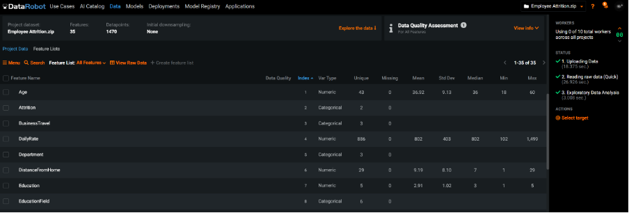
Uploaded file showing auto-generated summary stats and quality assessment
When data is loaded, the system automatically detects whether a field is continuous or categorical and will display values as histograms or bar charts as appropriate. In fact, DataRobot’s interrogation of the uploaded data alerted me to one field consisting of a single category and another where it had detected extremes. The technology also automatically detects issues like disguised missing values and target leakage where a field contains information that we could not know before the target event(s) occurred.
The model building process
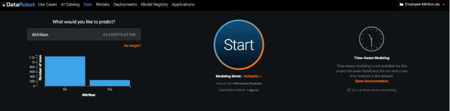
After an initial check of the summary stats, I’m ready to build a model. A large box at the top of the web page is simply labelled “What would you like to predict?”. As I type the first letters of the target field ‘Attrition’ into the box, it immediately autocompletes and identifies this as a classification problem. Had the target field been continuous, it would have classed it as a ‘regression’ type task. Moreover, DataRobot allows the user to perform ‘time aware’ modelling, demonstrating an impressive set of capabilities around time-series problems.
Having identified the target, I requested that the platform started the process of automatically building a series of competing predictive models. The default measure for ranking each model’s accuracy was Log Loss, but at this point I could have clicked the advanced options and dug quite deeply into how DataRobot builds and ranks models, choosing from a list of alternative accuracy measures such as AUC or Gini Norm as well as a lot of other parameters that control cross-validation partitioning, down sampling, feature constraints and even clustering.
The last choice I made, related to how exhaustive the process of finding the most accurate model should be. The default option is ‘Quick’ which is the least intensive of the model building modes. With my sample dataset, choosing this option resulted in a list of 13 models displayed in ranked order of accuracy on a ‘Leader board’ and took about 8 minutes to complete. I then experimented with choosing the more intensive ‘Auto-Pilot’ option, which exposes the training data to a larger set of predefined set of model types. In my case, this resulted in 40 models in total and took about 25 minutes to finish.
Setting up the automatic the model building process
DataRobot chooses and evaluates models based on their performance against increasingly larger sub-samples. For example, in full Autopilot mode, the platform begins the process by building models using a random 16% of the total data. DataRobot then selects the top 16 models based on their accuracy and re-runs them on 32% of the data. In the next round, it chooses the top 8 performing models and runs them on 64% of the data. As well as employing cross-validation techniques, it uses the next 16% of the data to further validate their performance before exposing the single best-performing model to a holdout sample of 20% of the data. The time taken to complete this process varies according to the modelling mode, the nature of the dataset as well as the system resources in the form of available ‘workers’ which users can increase or reduce during a run. In the end, I tried out the most intensive ‘kitchen sink’ option and executed the ‘Comprehensive’ model building mode, which after 3 hours resulted in 81 models displayed in the leader board. Interestingly, the difference in accuracy between the final ‘champion’ models was minimal, but each mode resulted in a completely different model type as the overall best. It’s also important to bear in mind that the system is flexible enough to allow me to completely overwrite these pre-built options and switch to a manual mode where I can specify exactly how the model selection process be executed.
Examining feature importance
A useful default setting is that DataRobot includes only what it considers ‘informative features’ in the modelling process. This is a list of fields that exclude redundant features such as reference IDs, or fields with empty or invariant values. In fact, one of the greatest strengths of the platform is the intelligent way in which it can extract new features from fields such as dates as well as its ability to work with and automatically derive features from image data as well as geographic and spatial information.
As a prelude to the modelling process, the platform executes an analysis of feature importance so that users can investigate which fields are most strongly correlated with the target, while the model building process is still going on in the background. Here, DataRobot employs a really excellent way to show how each field is related to the target category by displaying its distribution graphically and overlaying the attrition percentage as a line chart on a separate scale.
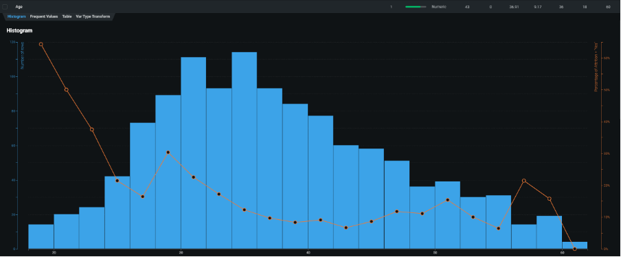
Histogram of employee age with attrition rate superimposed showing that younger employees are more likely to resign their positions
The Leader Board
When the model-building process completed, the leader board displayed each resultant model with its validation and cross-validation scores. When looking at the leader board containing the 40 models generated using Autopilot mode, I could see a mix of models built using open-source standards such as python, dmtk, keras and xgboost as well as native DataRobot algorithms. Furthermore, DataRobot automatically generated a series of ‘blender’ (or ‘ensemble’) models that were created by combining several individual models created during the process.
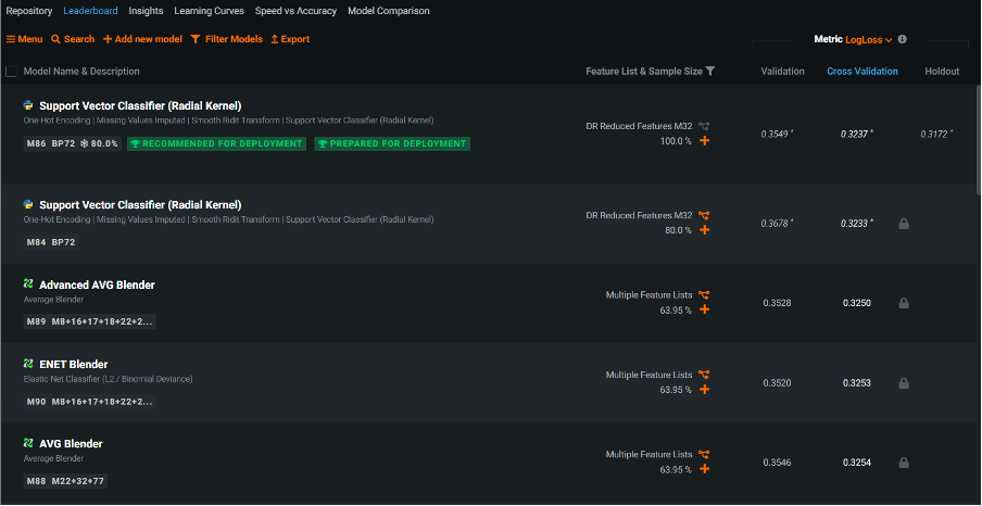
The Leader Board showing that based on the Log Loss cross validation scores, the ‘winning’ model was a python Support Vector Classifier
Each model was assigned its own id number as well as an id number for the particular ‘blueprint’ that it employed. Blueprints reveal the model components DataRobot created as part of its automated feature engineering process. They consist of pre-processing steps such as missing value imputation, one-hot encoding, text mining and ordinal encoding, all of which may help to boost model performance. In my example, the best model was generated using a python-based Support Vector Machine algorithm. It was assigned the model id 87 and blueprint number 72. DataRobot labelled this model as ‘Recommended for deployment’ and unlocked the last 20% of the data (the holdout sample) to further estimate its performance when eventually deployed. Using the default Log Loss measure of model accuracy, smaller values indicate less error and therefore greater accuracy.
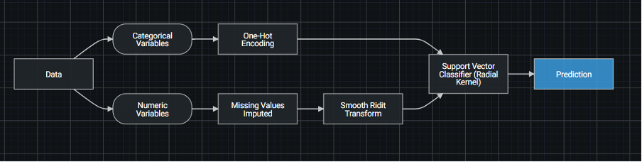
Blueprint 72 for the top model in the leader board – a support vector machine based on python
It’s worth pointing out that DataRobot also does a good job of documenting every aspect of the platform. In the case of blueprints, users need only to click on an element to see the parameters of that component or to reveal the documentation behind it.
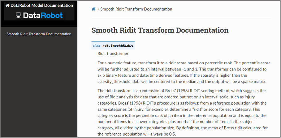
Documentation for the Smooth Ridit Transform component in a DataRobot blueprint
Examining the model
Clicking on the top model allowed me to interrogate it further. The first thing shown when browsing the accompanying Evaluate menu was a lift chart. Here the data are sorted into deciles according to the predicted attrition risk. The least risky deciles are on the left-hand side with an increasingly higher risk estimate as we move up through the deciles. The blue line represents the average risk scores generated by the predictive model. The orange line represents the actual proportion of cases that consist of employees who left the organisation. The data being plotted here was from the 20% holdout sample, but as with most DataRobot charts, I could interact with the output and switch to the validation or cross-validation samples. There were a few occasions when the blue line was above the orange and vice-versa but overall, I could see a reasonable correspondence between the actual and predicted proportions of leavers. At the 8th decile, the predicted risk based on 29 cases was 0.204 (20.4%) which closely matched the actual average of 0.207 (20.7%).
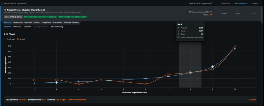
Lift chart showing estimated risk against actual employee attrition
The next chart shown was the ROC curve. This interactive graphic contained a host of fit measures (and many additional measures that could be added). I particularly liked the way the values for the model’s probability of attrition were displayed as two overlapping distributions representing those who did not leave the organisation (red) and those who did (blue). These kinds of charts illustrate how the probability scores generated by predictive models are really a function of how well they discriminate between the events in the target variable. The graphical tools here help us to see how choosing different probability thresholds, separating those who we predict to be leavers vs those who remain, affect the classification accuracy of the model. Note that these interactive distribution charts are also dynamically linked to an accompanying ROC chart and a confusion matrix. In fact, you can use the prediction distribution chart to automatically find the optimum cut-off value in order to maximise a fit statistic like F1 (in this case 0.2919). This threshold value yielded a true positive rate of 0.617 (61.7%) and false positive rate of 0.093 (9.3%). When I manually changed the probability threshold to 0.5 (50%), the false positive rate dropped to 0.0165 (1.65%) but unfortunately the true positive rate also dropped to 0.34 (34%). The point being that by choosing this threshold value, the model would accurately classify a much smaller proportion of leavers.
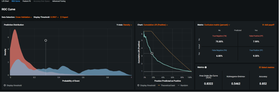
Interactive ROC curve and model fit statistics showing the default settings
The fact that I could switch the evaluation dataset used in the interlinked graphics from the hold out sample to cross-validation, as well as change the threshold value and the ROC chart to a cumulative lift plot, before requesting three alternative fit metrics and displaying the confusion matrix as a percentage, revealed just how flexible and powerful this aspect of the platform was as a model evaluation tool in itself.
Interactive ROC curve and model fit statistics showing custom settings
The next menu I explored was the Feature Fit output. These graphics allowed me to examine the individual categories and binned values of the model’s input (predictor) fields and compare their estimated risk to the actual risk. By doing so, users can identify sub-groups and ranges in the examined fields where the model hasn’t managed to adequately map the estimated risk signal to the actual average risk. With categorical features, the actual risk is denoted with an orange circle and the estimated risk with a blue cross. Looking at the field ‘Job Role’, I was able to see a fairly good correspondence between the predicted and actual risk of attrition across the various groups especially those with larger frequency counts. However, those working in Human Resources had an average attrition rate of 0.6 (60%) whereas the predicted risk was only 0.31 (31%). In reality, it wasn’t especially concerning as there were only 5 records in this group, but I appreciated the simple and intuitive manner in which the system presented this information.
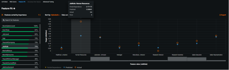
Feature Fit chart showing estimated and actual risk for the groups in the field Job Role
The final menu of the Evaluate section was Advanced Tuning. Here I am able to manually set new model parameters, overriding the existing ones that DataRobot created for a given model. For example, I could change the pre-processing settings in the winning model such as one-hot encoding or the model building parameters for the Support Vector Machine algorithm itself. By changing the kernel function from RBF (Radial Basis Function) to Poly (Polynomial), I was able to re-build the model and have the new iteration added to the leader board with an automatically generated label ‘Tuned from M86 with kernel = poly’.
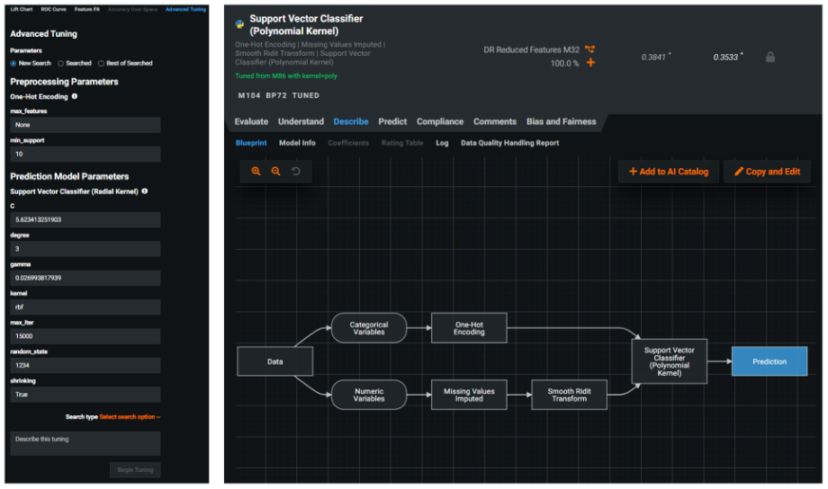
Advanced tuning options with the results of creating a re-tuned version of the winning model using a polynomial kernel
But there’s even more to see in this section of the platform. Opening the Understand menu allowed me to examine the Feature Impact chart, showing which features were driving the model decisions in ranked order. Unlike the green feature importance bars shown earlier in the Data section, which apply to the entire dataset prior to modelling, here the fields were ordered in terms of their impact within the context of the individual selected model. In the sample dataset, the most important feature related to whether or not the employee worked overtime shifts.
Feature Impact chart showing the model’s input fields ranked in terms of their importance
The Prediction Explanations chart is yet another key output that DataRobot generates. It allows users to investigate what’s driving a specific prediction score for an individual row of data. By default, the chart isolated the top 3 and bottom 3 rows of data in terms of highest and lowest probability values. I noticed this can be easily adjusted using an interactive slider to increase or decrease the thresholds dynamically. Another default setting was that the tool showed the top 3 features exhibiting the strongest effect on the probability score. In the first example I investigated, row 463 had the highest probability of attrition with a score of 0.986 (98.6%). This was despite the fact that the employee had a job satisfaction rating of 4. This rating is actually strongly associated with a decrease in the likelihood to switch employment, which DataRobot denoted with 3 consecutive ‘minus’ signs. The next two field names however were accompanied by 2 consecutive ‘plus’ signs, indicating that being an overtime worker with no stock options had a moderate effect on increasing the likelihood of employees to leave. So why did this case exhibit such a high probability of attrition? By increasing the display value so that I could view the top 10 features driving the score, I could see that 9 out of the 10 features all had a moderate effect on driving up the probability of attrition. Almost certainly, it was this combination of several fields, all associated with a moderate increase in attrition risk, that led to such a high score.
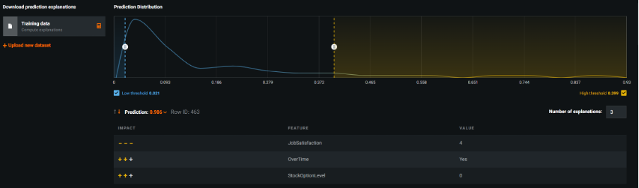
Prediction Explanations chart for Row 463 showing the top 3 fields that have the strongest impact on the estimate
At this stage of the analysis, I switched to the Prediction tab where I encountered a simple interface to upload a test dataset and batch score it using my chosen model. This interactive approach is designed to be used with non-deployed models directly from the leader board and can be executed via the UI or via an API and is suitable for datasets of less than 1GB. In my example, I tested it out using the same training dataset, once the predictions were computed, I was able to download the resultant csv file and check that it had worked.
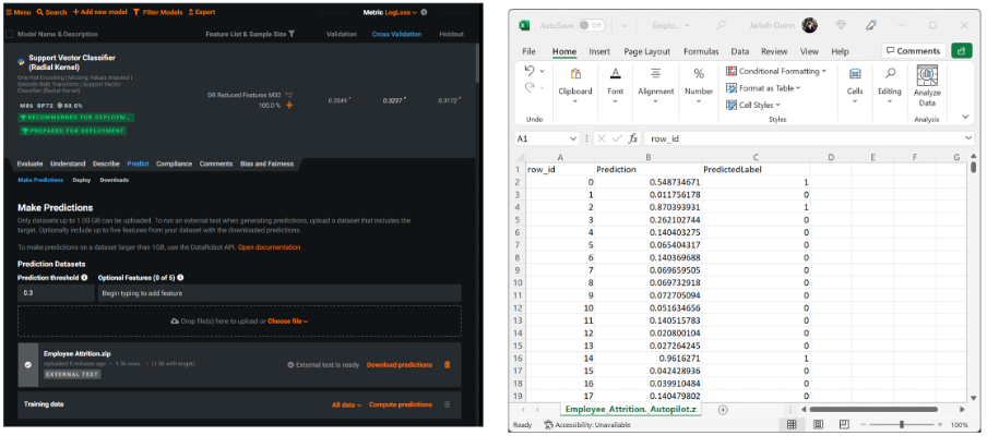
Making predictions using the UI batch scoring interface – the scored csv file is then downloaded and displayed in Excel
DataRobot supports a number of ways in which models can be deployed for scoring purposes. The deployment methods you use depend on factors such as data volumes, whether a scheduled or real time approach is needed, and the degree of monitoring required for in-production models. Moreover, deployments can be configured via the user interface or DataRobot’s prediction API. Models can also be exported as scoring code (JAR files) for use outside of the platform. I noticed that when creating a Deployment for my leading model, I unlocked a number of additional services that allowed me to monitor the scoring activity over time. These included dashboards showing the health of the service itself, whether any data drift occurred in the predictor fields due to changes in the real-world, the accuracy of the predictions, champion-challenger analysis, and even the option to set up continual learning to automatically retrain new models as fresh data becomes available.
Unlocking monitoring services for a deployed, in-production model
One of the most impressive aspects of the platform, is that there are still many other facets of the technology that I haven’t yet touched on: such as the ability to create model compliance reports that document a model’s theoretical framework as well as its precise development details; analysis pf model bias and fairness that help to identify if a model is biased even tracing the source of the bias back to the fields in the training data; DataRobot’s admin and collaboration facilities that control platform access rights, deployment approval and the sharing of models between users; model insight charts that show output like word clouds for key text fields coloured by the values of prediction probabilities; speed vs accuracy charts that illustrate each model in the leader board plotted by build time and its chosen model accuracy metric; model comparison charts that allow data scientists to compare the performance of one model against another; and DataRobot’s app builder with its dedicated UI enabling the development of easy-to-use predictive, optimisation or what-if analysis apps for sharing with stakeholders and clients.
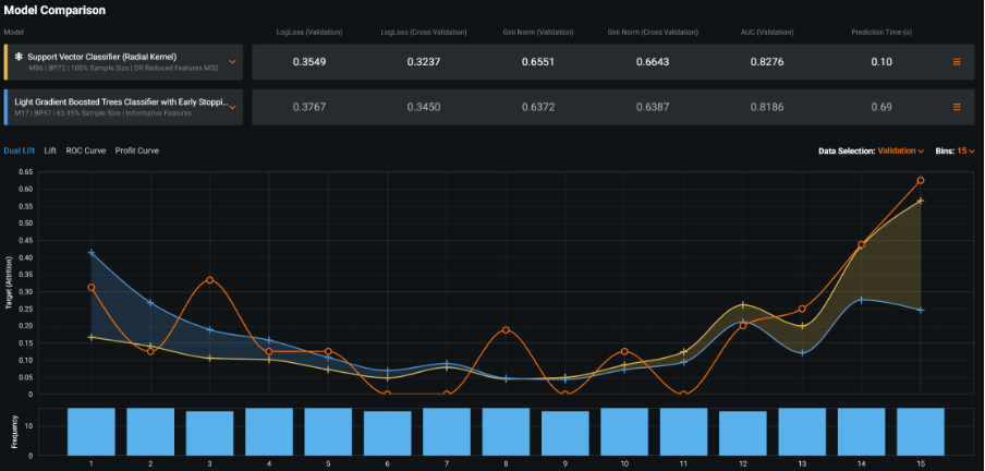
Model comparison tool – for comparing the performance of one model against another
Working with DataRobot, one can’t fail to be impressed by the degree of investment and attention to detail that the development team have lavished on it. As a data science studio, it demonstrates a number of really innovative approaches to model building (especially when combined with its own excellent data preparation environment, Paxata). As a cloud AI platform, it approaches the problem of delivering end-to-end applications, across multiple personas, whilst maximising productivity, with a level of commitment that’s truly pioneering.
Talk to us today about how DataRobot can help you
If you’d like to find out more about how DataRobot might be able to help you then get in touch – we’d love to talk to you.