You may have noticed that many media outlets are illustrating the tragic course of the coronavirus (COVID-19) pandemic by employing charts with log scales. These log values refer of course to the mathematical concept of logarithms. This is something that most of us learn about in school when we are taught that a logarithm is the power to which a number must be raised in order to get some other number. If, for example, we raise the value 10 to the power of 2, we get 100. Therefore the ‘base 10’ log of 100 is 2. If this all seems rather abstract, the only thing you need to bear in mind is that this same principal allows us to address the problem of trying to chart data with extreme values.
To illustrate this look at Figure 1 below.
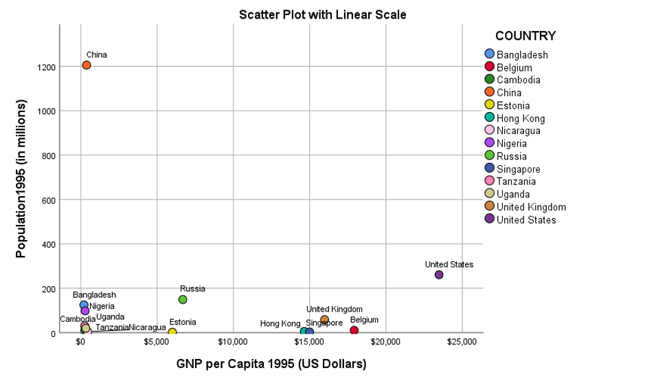
The chart shows the relationship between GNP per capita and population size for a group of semi-randomly chosen countries in 1995. The problem with this chart is that there are a group of countries so close to horizonal axis that it’s hard to tell what their relative population sizes are. In fact, there is a further cluster of countries that are so close to zero on both the horizontal and the vertical axes that its difficult to even read their names.
The reason for this is that there are two nations with extreme values for each axis. Firstly, China had a population of over 1.2 billion people in 1995. This is far greater than any of the other countries at that time, so much so, that the other nations are squeezed together on the vertical Y-axis. Similarly, the United States had a much higher GNP per capita value than several of the developing nations, to the extent that they appear tightly clustered together on the horizontal X-axis.
This illustrates one of the problems analysts encounter when they attempt to chart the relationship between variables whose values can range by one or more orders of magnitude.
Now look at Figure 2 which shows the same scatterplot but this time the vertical and horizontal axes are not linear. Instead they are calculated using Log (base 10) scales.
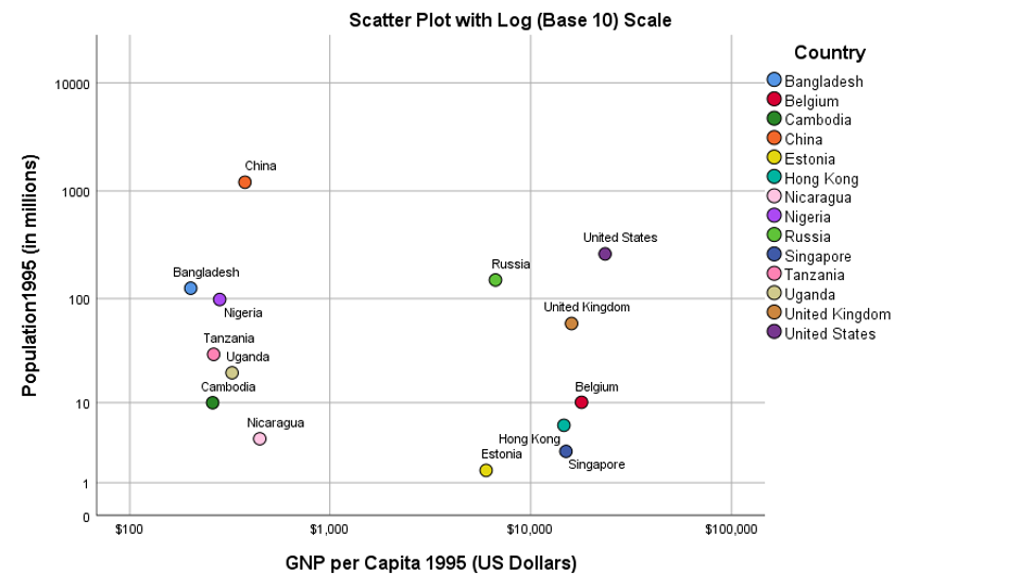
In this second chart the values in the higher ranges are compressed so the scale appears to ‘accelerate’ the higher we go. Is Figure 2 a clearer way to illustrate the relationship between these two variables for the countries concerned? That depends on how you argue your case. Although it’s easier to discern the countries in the scatterplot, the elastic nature of the log scale means that their relative differences appear to have been affected.
Look at how much closer Estonia is to Hong Kong and Singapore in Figure 2 compared to Figure 1, and how much closer Bangladesh is to China in terms of population size. We could have created a similar chart by basing the axes on the square root of the two variables. Just like using log scales, the effect would be to more heavily ‘penalise’ the larger values than the smaller ones.
Recently, high profile statisticians such as Nate Silver, author of the 2012 book The Signal and the Noise, have questioned the appropriateness of using log scales when attempting to compare the cumulative growth rates in reported coronavirus infections and their associated mortality. We can see some of the same issues that the earlier scatterplot examples illustrated when we compare cumulative mortality for a selection of countries (France, Italy, Spain, Germany, Ireland, the UK and the US) in Figures 3 and 4. The data used to create the charts is taken from the website of the European Centre for Disease Prevention and Control and shows the trend for each of the selected countries when the cumulative mortality had reached at least 10 cases.
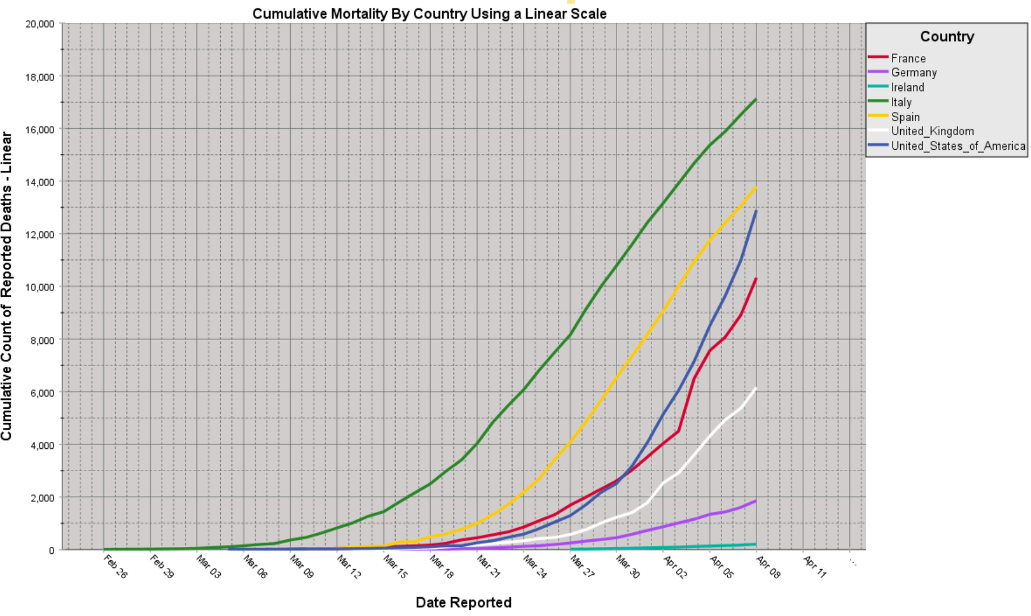
Looking at Figure 3 we can see an exponential increase in mortality for the US. This is characterised by the distinctive upward curve of the trend. Indeed, it appears to be converging with (or about to cross) the trend for Spain. The other countries appear to follow a more parallel course to each other. For Italy, the apex of the linear trend shows only the slightest hint that the cumulative mortality rate is starting to slow. Ireland, on the other hand, with its relatively small population and much smaller mortality count, barely registers on the chart.
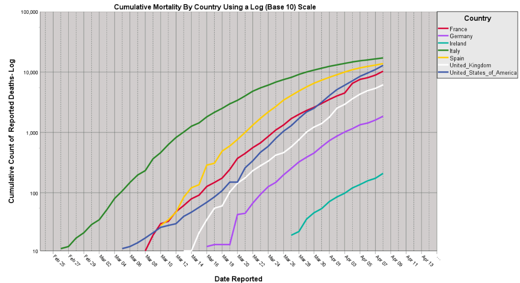
Compare and contrast this picture with Figure 4 which employs a log (base 10) scale on the vertical axis. The chart appears to show that the trends for Italy and Spain are already beginning to level off. Moreover, the top five countries in terms of total mortality, appear to be converging, as the relative differences between values as far apart as 6,159 (the UK) and 17,129 (Italy) are squeezed by the log scale.
A further effect of using this kind of scale is that the exponential curve the US exhibited in Figure 3 now appears as a straight line. Indeed, this a well-known feature of using logs and statisticians have employed it for decades to transform data so that they can be incorporated in linear models. Lastly, we can now more clearly see a mortality trend for Ireland as the lower part of the Y axis magnifies values of less than 200.
The upshot of this, is that charts using log scales need care (and skill) when interpreting. When comparing groups or trends measured across orders of magnitude, perhaps a simpler approach where separate charts are produced for groups with the same relative spread of values could be employed in order to make the comparisons more intuitive.
If you would like to recreate the charts shown in Figures 3 and 4 using IBM SPSS Statistics, we have included instructions on downloading the latest data from the ECDC website with an accompanying SPSS syntax file that will prepare the data and generate these (and other) outputs.